


Paint manufacturers have released their directional forecasts for 2027, pivoting sharply toward earthy browns, saturated greens, and muted pinks. For property investors and owners, translating these cyclical palettes into permanent finishes requires careful calibration between ephemeral fashion and lasting architectural appeal.
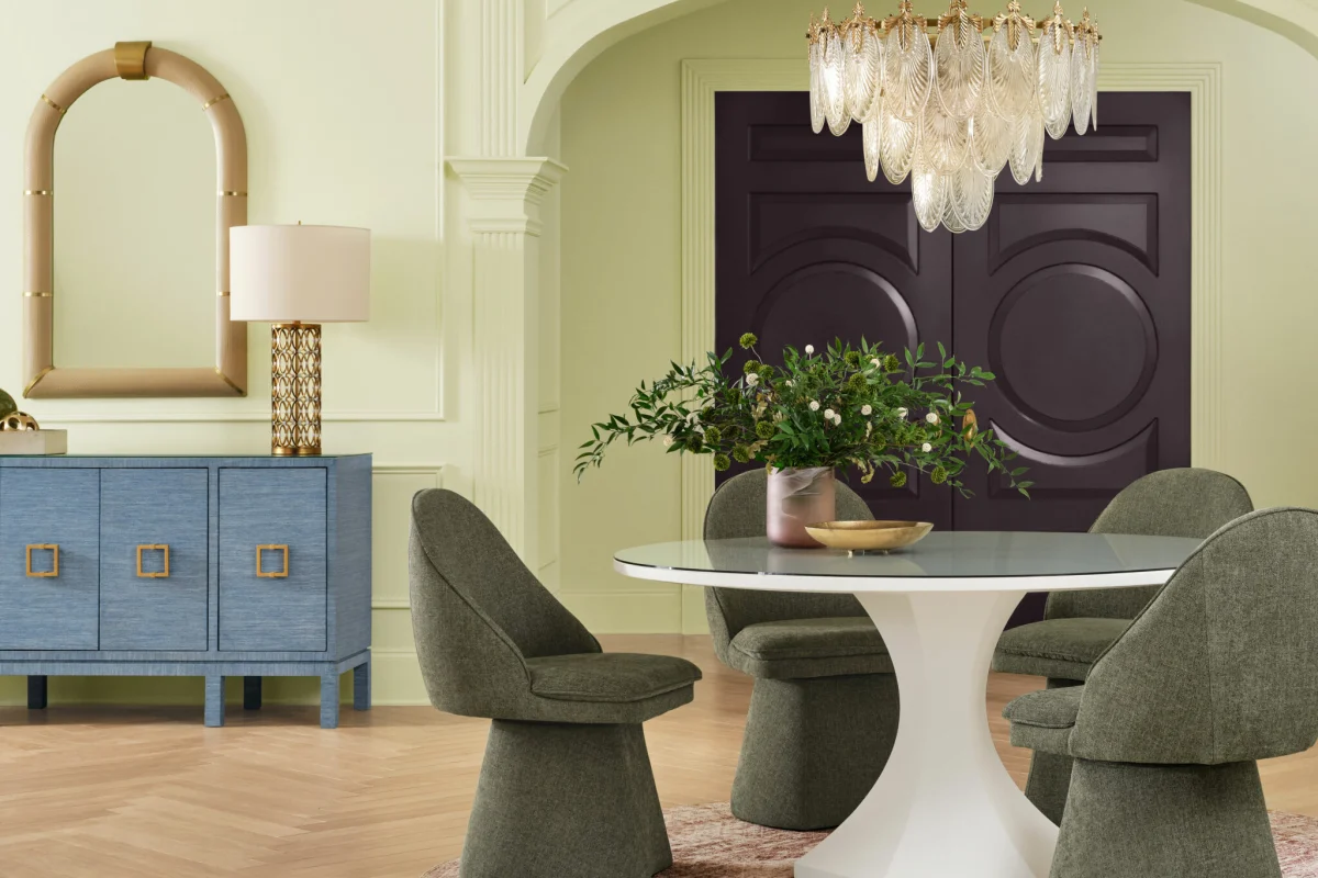
Original feature2027 Colors of the Year: The Shades Defining DesignDesign Milk · 4 November 2026 →
The 2027 Palette: From Botanical Greens to Deep Earth
As reported across recent industry forecasts including announcements by Benjamin Moore and seasonal roundups by Design Milk, the palette for 2027 marks a decisive departure from clinical greys and stark whites. Instead, the focus shifts to organic hues that mimic the natural world. Deep forest greens, rich terracotta browns, and restrained, chalky pinks dominate the landscape.
In high-end residential design, these shades provide an immediate sense of gravity and enclosure. However, applying them successfully across a portfolio requires understanding how light interacts with high-pigment paints. Darker, earth-based tones absorb natural light, necessitating a thoughtful lighting layout with layered low-level fixtures rather than flat overhead illumination.
Materiality Versus Pigment: What Retains Value
Paint is inherently temporary, typically requiring refreshment every three to five years. Therefore, treating a color trend as a structural investment is a common misstep. Lasting resale value is not generated by the pigment on the wall, but by the substrate beneath it and the materials paired with the color.
When incorporating 2027’s earthy browns and greens, pair them with authentic, tactile materials that age well: unlacquered brass hardware, oiled European oak joinery, natural limestone, and matte tadelakt plaster. These elements introduce genuine craftsmanship and texture, ensuring that even if a specific wall colour falls out of favour, the room retains its foundational luxury.
Budget-Scalable Applications for Different Markets
Applying directional colour trends does not require a complete architectural overhaul. At the entry level, restrict bold 2027 terracotta or olive shades to secondary spaces such as powder rooms, studies, or joinery interiors. This allows owners to test high-impact palettes without committing expensive square metreage to a potentially short-lived trend.
For prime and super-prime properties, scale the application through artisanal wall finishes. Limewash, Roman clay, and colour-matched lime plasters offer the moody, light-diffusing qualities of the 2027 forecasts while adding structural depth that standard emulsion simply cannot replicate. This approach signals high-end craftsmanship to prospective buyers during a valuation.
- Treat paint as a seasonal layer; anchor long-term value in permanent architectural materials like natural stone and timber.
- Balance dark, saturated 2027 earth tones with layered, low-level architectural lighting to prevent spaces from feeling claustrophobic.
- Test directional color trends in smaller rooms, libraries, or joinery interiors before committing to open-plan living areas.
- Invest in artisanal wall treatments such as limewash or lime plaster to add tactile depth that standard flat paint lacks.
- Ensure hardware finishes, such as unlacquered brass or bronze, complement the warmth of organic browns and greens.
For institutional investors and private vendors, overly idiosyncratic colour choices can narrow the pool of prospective buyers during a resale cycle. However, the grounded, organic palettes projected for 2027 broadly enhance marketability by creating a calm, cohesive atmosphere that photographs well for digital marketing. When renovating for yield or capital growth, employ these trend-led shades in easily changeable elements like walls and soft furnishings, while keeping fixed assets—such as kitchen cabinetry carcasses, flooring, and bathroom tiles—in neutral, enduring finishes.
Related reads
These Are the Colors Paint Brands Are Betting on for 2027 (Design Milk, 4 Nov 2026)
Pantone NYFW spring/summer 2027 color trend report: the top 10 colors (Fashion United, 21 Sep 2026)
The Spring 2027 Color Report: The 6 Exact Shades That Will Define Next Season (Who What Wear, 22 Oct 2026)
Benjamin Moore’s Color of the Year 2027 Is the Design Equivalent of Touching Grass (Architectural Digest, 14 Oct 2026)
The First 2027 Colors of the Year Are Here—and They’re Anything but One-Note (ELLE Decor, 14 Oct 2026)
Sources & credits
- Feature: 2027 Colors of the Year: The Shades Defining Design — Design Milk. Linked, not reproduced.
- Main image: Design Milk, from the original feature linked above; all rights remain with the publisher and photographer.
- Headlines via Google News RSS; content belongs to the linked publishers.
Videos are embedded from their original YouTube channels and remain the property of their publishers; ClubProperty hosts no third-party footage or photography. Prices and details are as reported by the sources linked above at the time of writing. Nothing here is financial advice.
Artículos relacionados
The Economics of Maximalist Interiors and Resale Appeal
How to balance bold, high-end interior styling with long-term property liquidity, drawing lessons from…
Leer másCivic Architecture and Neighbourhood Value
Explore how forward-thinking civic architecture, from Québec conversions to Toronto urban treehouses, shapes premium…
Leer másCurating Space: Atlântica House in São Paulo
Felipe Hess Arquitetos balances a major contemporary art collection with family life on a…
Leer másMaximising Compact NYC Real Estate Through Custom DIY Design
Explore how self-taught craftsmanship and bespoke joinery transformed a compact New York City apartment…
Leer más