


The 1970s headquarters of the Johnson Publishing Company in Chicago stands as a masterclass in corporate interior design of the mid-century era. Documented in a new monograph by photographer Barbara Karant, the spaces reveal a sophisticated dialogue between bold colour palettes, custom millwork, and uncompromising craftsmanship.
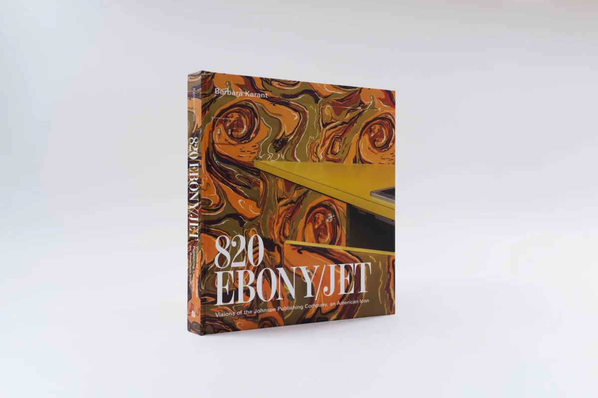
The Palette of an Era
The interior landscape of the former Johnson Publishing Building, publishers of Ebony and Jet magazines, offers a masterclass in committed colour theory. Rather than defaulting to the sterile corporate greys or understated beiges that dominated late-twentieth-century office design, the headquarters embraced rich jewel tones, vibrant oranges, deep purples, and warm earth hues.
This fearless approach to colour demonstrates a timeless design lesson: when hues are rooted in natural pigments and balanced with heavy textures, they avoid looking dated. Applying saturated tones to architectural surfaces rather than temporary decor creates an immersive spatial identity that carries lasting architectural merit.
Materials and Craftsmanship
A defining characteristic of the Chicago headquarters is its extensive use of bespoke joinery, heavy wood veneers, and tactile wallcoverings. Artisanal craftsmanship was not treated as an expensive afterthought; it formed the foundational layer of the interior architecture.
Investing in high-grade, durable materials—such as solid hardwoods, natural stone, and heavy wool textiles—ensures that an interior ages with patina rather than decay. In contemporary residential or commercial projects, allocating budget toward permanent structural finishes rather than superficial surface treatments remains the most reliable strategy for long-term value retention.
Light and Spatial Flow
The layout balanced private executive domains with open collaborative zones long before the modern open-plan office became ubiquitous. Strategic placement of bronze-tinted glass, slatted wood partitions, and open sightlines allowed natural light to penetrate deep into the floorplate while maintaining acoustic and visual privacy.
Controlling light through architectural screening rather than standard drywall partitions allows spaces to feel dynamic throughout the day. This spatial fluidity is a primary driver of desirability in both high-end residential and premium commercial real estate.
Furniture as Architecture
Much of the furniture within the Johnson Publishing building was custom-designed for the space, blurring the line between architecture and interior decoration. Built-in seating, oversized executive desks, and integrated lighting fixtures ensured that every room felt complete and intentional.
When furnishing a property at scale, integrating permanent or semi-permanent joinery reduces reliance on transient furniture trends. Buyers and investors consistently respond favourably to spaces where the furniture feels intrinsic to the building’s structural DNA.
- Commit to a cohesive, saturated colour palette rather than relying on neutral defaults.
- Invest budget in permanent architectural millwork and durable natural materials.
- Use internal screening and glass partitions to manage light and privacy fluidly.
- Incorporate built-in furniture to anchor rooms and reduce reliance on transient trends.
- Prioritise bespoke craftsmanship to ensure interiors develop a sophisticated patina over time.
The preservation of mid-century corporate interiors, as documented in Karant's photography of the Johnson Publishing building, highlights a growing appreciation for twentieth-century commercial architecture. While many period interiors are thoughtlessly gutted during refurbishment cycles, properties that retain authentic, high-quality custom design elements often command significant cultural and commercial prestige. For real estate investors, recognizing the intrinsic asset value of intact architectural history can protect against the homogenising tendencies of modern commercial renovations. Buildings with verified provenance and distinct interior identity frequently secure superior tenant retention and long-term capital appreciation in competitive urban markets.
Povezane knjige
A New Book Preserves the Lost Interiors of Ebony and Jet’s Chicago Headquarters (Design Milk, 13 Oct 2026)
Inside the Iconic Johnson Publishing Headquarters in Chicago (Chicago Defender, 13 Oct 2026)
Izvori i zasluge
- Feature: A New Book Preserves the Lost Interiors of Ebony and Jet’s Chicago Headquarters — Design Milk. Linked, not reproduced.
- Main image: Design Milk, from the original feature linked above; all rights remain with the publisher and photographer.
- Naslovi putem Google News RSS; sadržaj pripada povezanim izdavačima.
Videozapisi su ugrađeni s njihovih izvornih YouTube kanala i ostaju vlasništvo njihovih izdavača; ClubProperty ne sadrži snimke ili fotografije trećih strana. Cijene i detalji su onakvi kakve su izvijestili izvori povezani gore u vrijeme pisanja. Ništa ovdje nije financijski savjet.
Povezani članci
Hotel Plaza u New Yorku započet će četverogodišnje zatvaranje 2027. godine
Kultni hotel Plaza u New Yorku planiran je za zatvaranje 2027. godine zbog opsežnog...
Pročitajte višeBerkshire Georgian Estate u Hurst Groveu na prodaju za £11,3 milijuna
Hurst Grove, obnovljeno gruzijansko imanje iz 18. stoljeća na 37 jutara u Berkshireu, bilo je...
Pročitajte višeAerin Lauder i Kohler donose Delftware u modernu kupelj
Aerin Lauder surađuje s Kohlerom na kolekciji Fleurette Artist Editions, predstavljajući cvjetne motive inspirirane Delftom...
Pročitajte višeArhitektonska iluminacija: Nove zbirke Coil + Drift
Istražite kako najnovije kolekcije rasvjete Coil + Drift koriste arhitektonsku suzdržanost i materijalnu vještinu...
Pročitajte više