


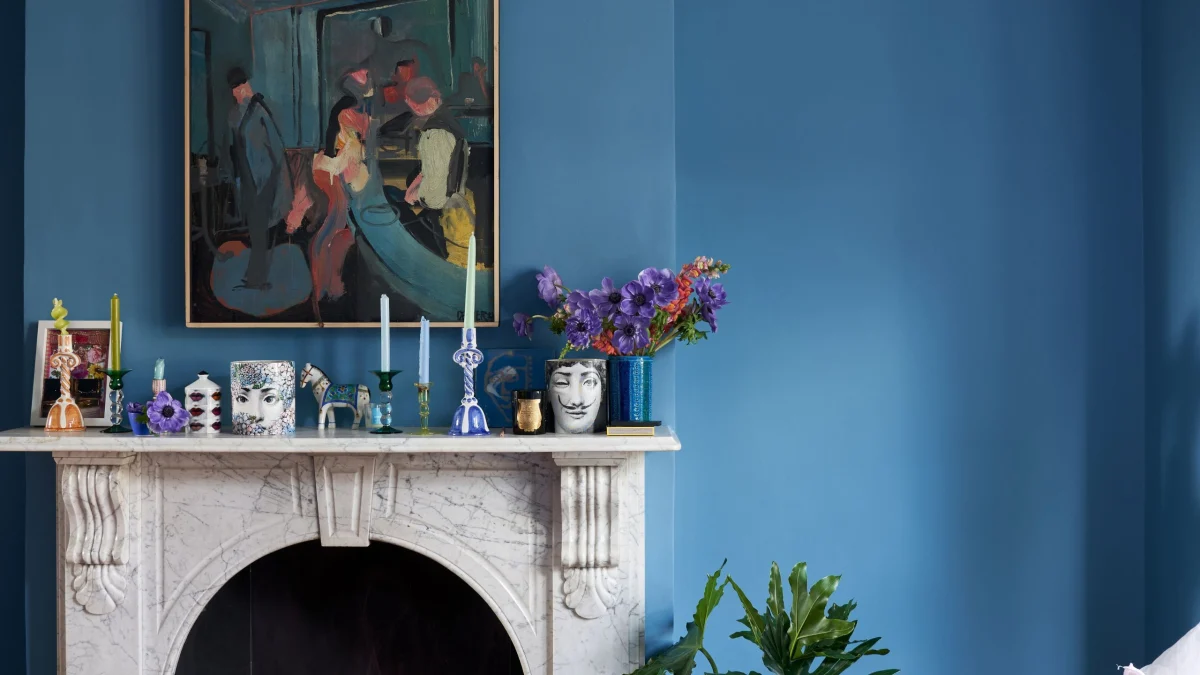
As autumn prompts a pivot toward grounding hues, designers are turning to cornflower blue to inject both clarity and warmth into high-end schemes. This purple-infused tone offers a sophisticated alternative to heavy neutrals, bridging seasonal transitions with understated precision.
The Psychology of the Shade
Interior architecture relies heavily on how ambient light interacts with primary wall treatments. Unlike stark primary blues or heavy navy tones that can absorb natural daylight during shorter autumn days, cornflower blue possesses a subtle violet undertone. This specific formulation reflects light rather than swallowing it, making it an effective choice for rooms with northern or eastern exposures.
Reported design trends for the latter half of the year indicate a departure from ubiquitous beige in favour of dominant yet liveable shades. Cornflower blue functions as a bridge between summer’s crispness and winter’s need for enclosure. When applied correctly, it introduces a sense of calm without tipping into clinical coldness, anchoring large spaces while maintaining architectural breathing room.
Materiality and Texture: Balancing Cool Tones
Introducing a vibrant colour scheme requires careful calibration of tactile elements to avoid an austere finish. Cornflower blue pairs exceptionally well with tactile, dense materials that absorb sound and soften the visual perimeter of a room. Heavy wool rugs, unlacquered brass hardware, and warm-toned woods such as European oak or walnut provide the necessary counterweight to the coolness of the blue.
At a luxury budget level, upholstered pieces in mohair velvet or heavy linen mixes catch light differently across the day, creating depth. For those working within more modest parameters, introducing the shade through heavy cotton velvet cushion covers, textured ceramics, or glazed tiles achieves a similar layered effect without committing permanent wall space to a seasonal inclination.
Lasting Resale Value Versus Fleeting Fashion
Property investors must constantly evaluate whether a bold interior choice will alienate potential buyers upon resale. While wall-to-wall bright paint is easily rectified, architectural integration requires more consideration. Using cornflower blue on built-in joinery, library shelving, or kitchen islands offers a sophisticated statement that reads as intentional rather than impulsive.
Timeless design relies on proportion and context. When this shade is restricted to moveable furnishings, textiles, or secondary joinery, it remains a flexible layer rather than a permanent fixture. Buyers respond positively to schemes that demonstrate confidence in colour, provided the underlying joinery, flooring, and lighting infrastructure remain neutral and of high specification.
- Pair cool cornflower blue with warm timber finishes like walnut to ground the space for autumn.
- Use the shade on textured textiles such as wool or mohair velvet to add physical and visual warmth.
- Apply the colour to joinery or freestanding furniture rather than structural walls for easier future updates.
- Consider room orientation; the subtle violet undertones help reflect natural light in northern-facing spaces.
- Balance vibrant paint choices with neutral, high-specification flooring and architectural hardware.
For properties positioned at the upper end of the international market, interior styling serves as a crucial marketing tool during viewings, particularly during autumn selling seasons. While colour trends fluctuate, properties that showcase a confident, cohesive palette often achieve higher engagement from prospective buyers who value turnkey readiness. However, astute investors know that structural finishes—such as flooring, stone, and architectural lighting—must remain universally appealing. Using a contemporary accent shade solely within soft furnishings and modular joinery protects asset liquidity while capitalising on current design appeal.
Related reads
This Sophisticated Shade of Blue Is Giving Fall Interiors a Fresh New Look (Homes and Gardens, 9 Oct 2026)
Sources & credits
- Feature: Cornflower Blue Is the Sophisticated Shade Bringing a Fresh Feel to Fall Interiors — Homes & Gardens. Linked, not reproduced.
- Main image: Homes & Gardens, from the original feature linked above; all rights remain with the publisher and photographer.
- Headlines via Google News RSS; content belongs to the linked publishers.
Videos are embedded from their original YouTube channels and remain the property of their publishers; ClubProperty hosts no third-party footage or photography. Prices and details are as reported by the sources linked above at the time of writing. Nothing here is financial advice.
Kapcsolódó cikkek
Maximising Compact Space Through Bold Design in Moscow
Exploring how a 400-square-foot Moscow apartment uses vibrant colours and clever layout planning to…
További információkThirty Years of the Andrew Martin Interior Design Review
As the Andrew Martin Interior Design Award marks three decades, we examine how global…
További információkModernist Waterfront Home Near Copenhagen Hits the Market
A 1957 modernist house on the water north of Copenhagen is for sale, offering…
További információkSnøhetta Completes the Shanghai Grand Opera House
Explore Snøhetta's newly opened Shanghai Grand Opera House, featuring a helical, hand-fan-inspired staircase and…
További információk