


Integrating saturated color into a high-end residence requires a rigorous architectural approach rather than a purely decorative one. As reported in recent design analysis, managing intense pigments successfully depends entirely on contextual lighting and material grounding.
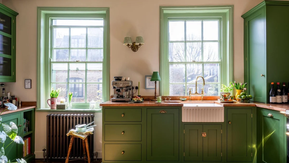
Grounding Saturated Pigments with Natural Materials
When deploying high-saturation hues across walls or joinery, the risk of visual fatigue increases significantly if the surrounding palette lacks tactile counterweights. Premium interiors rely on raw, textural elements—such as unlacquered brass, honed travertine, or fumed oak—to absorb and diffuse intense light reflections. These materials anchor the space, ensuring that deep blues, forest greens, or rich ochres read as sophisticated rather than aggressive.
At a more accessible budget, the same principle applies through the introduction of textured textiles like heavy linen, jute, or brushed wool. The objective is to create micro-shadows within the surface finish, which softens the uniform glare of flat emulsion paint and adds long-term visual depth to the room.
The Physics of Light and Tone
Color is entirely dependent on illumination. A pigment selected under harsh retail showroom lighting will behave entirely differently in a residence with north-facing versus south-facing glazing. Designers typically evaluate large-scale draw-downs across different times of day before committing to permanent finishes.
Layered lighting is essential when working with deep colorways. Relying solely on a central ceiling fixture will flatten saturated walls, making them appear heavy and oppressive. Instead, combine indirect perimeter washing, low-level task lamps, and directional picture lights to create gradients of shadow and illumination that animate the space.
Resale Value Versus Ephemeral Trends
Permanent architectural changes, such as bespoke joinery or integrated wall paneling, represent significant capital expenditure. When applying bold colors to these fixed assets, resale liquidity can be compromised if the shade is too tied to a micro-trend. High-value asset management favors neutral foundational elements—flooring, stone surfaces, and architectural moldings—allowing color to be introduced through easily interchangeable elements.
If bold paint or wallcoverings are applied directly to primary structural walls, prospective buyers factor in the cost of remediation. Therefore, using saturated tones on freestanding architectural screens, library shelving inserts, or powder rooms offers the visual impact of boldness while preserving the broader market appeal of the property.
- Pair saturated wall colors with matte, tactile materials like honed stone and unlacquered metal to diffuse light.
- Test large paint swatches on-site across 24 hours to observe how natural daylight alters the undertones.
- Reserve permanent, high-cost saturated finishes for joinery inserts or smaller spaces like powder rooms.
- Use layered lighting—combining low-level and directional sources—to prevent deep colors from feeling flat.
- Maintain neutral floors and ceilings to anchor intense wall pigments and preserve spatial volume.
In the premium residential sector, highly personalized interior design can be a double-edged sword for liquidity. While bespoke color schemes and artisanal wall treatments elevate the immediate lifestyle appeal for the current owner, prospective buyers evaluating an asset at the luxury tier frequently calculate the capital expenditure required to return spaces to a neutral baseline. Consequently, properties featuring versatile architectural layouts and easily modifiable decorative layers consistently achieve broader market demand and more predictable resale valuations.
Related reads
7 Designer Tips for Pulling Off Bold Colors Without Overwhelming Your Home (Homes and Gardens, 31 Oct 2026)
Designers Love "Tasteful Horse Decor." Here's How to Pull It Off Without Looking Tacky (House Beautiful, 12 Oct 2026)
53 Blue Kitchen Design Ideas (HGTV, 18 Sep 2026)
4 Pedicure Colors And Designs For The Ultimate Early '00s Look (Women.com, 31 Oct 2026)
Sources & credits
- Feature: 7 Designer Tips for Pulling Off Bold Colors Without Overwhelming Your Home — Homes & Gardens. Linked, not reproduced.
- Main image: Homes & Gardens, from the original feature linked above; all rights remain with the publisher and photographer.
- Headlines via Google News RSS; content belongs to the linked publishers.
Videos are embedded from their original YouTube channels and remain the property of their publishers; ClubProperty hosts no third-party footage or photography. Prices and details are as reported by the sources linked above at the time of writing. Nothing here is financial advice.
関連記事
Timeless Design Choices from Mexico City’s Book‑Lined Bar
How material, light and layout in Em‑Estudio’s basement bar create lasting value and ideas…
続きを読むIlluminating the Threshold: Exterior Lighting Design and Value
Explore how intentional exterior lighting design enhances residential appeal, balances atmosphere, and protects long-term…
続きを読むThe Architecture of Seasonal Interiors: Beyond the Trend Cycle
Explore how to integrate fleeting festive trends like the popular bow motif without compromising…
続きを読むRethinking the Checkerboard: The Brooklin Apartment
Küster Brizola Arquitetos transforms a 200-square-meter São Paulo residence, using a reimagined checkerboard floor…
続きを読む